how to increase ecommerce conversion rate: A Practical Guide
Increasing your store’s conversion rate isn’t about guesswork; it’s a systematic process of figuring out why visitors leave without buying and then fixing those leaks. The whole thing kicks off with a...
By The SaaS Hub Team · 2025-11-07
how to increase ecommerce conversion rate: A Practical Guide
Increasing your store’s conversion rate isn’t about guesswork; it’s a systematic process of figuring out why visitors leave without buying and then fixing those leaks. The whole thing kicks off with a deep dive into your customer journey data. You have to pinpoint the exact drop-off points, from the moment someone discovers a product to the final click at checkout.
Finding and Fixing Your Conversion Rate Bottlenecks
Before you can plug the leaks in your sales funnel, you have to find them. This means ditching your assumptions and becoming a data detective for your own store. Guessing where the problems are is just a recipe for wasted time and effort—your data, on the other hand, is a clear map leading straight to the treasure.
The first move is to trace the actual path your customers take. A tool like Google Analytics is indispensable here. It lets you visualize the customer journey and see precisely where shoppers are abandoning their carts or just bouncing off your site entirely.
Mapping the Customer Journey With Data
Your main goal here is to understand the flow of traffic from the second a visitor lands on your site to the moment they complete a purchase. The most effective way to do this is by setting up conversion funnels. A funnel report gives you a step-by-step visual of this path, instantly highlighting the biggest areas of abandonment.
For example, a typical ecommerce funnel for a fashion store might look like this:
- Visited Homepage (10,000 users)
- Viewed a Category Page (e.g., "Women's Dresses") (7,000 users)
- Viewed a Product Page (4,000 users)
- Added Item to Cart (800 users)
- Initiated Checkout (400 users)
- Completed Purchase (250 users)
By tracking the percentage of users who move from one step to the next, you can immediately see where your biggest leaks are. In this example, the drop from "Viewed Product" to "Add to Cart" is massive (a 3,200 user drop-off), suggesting issues on the product pages themselves.
> A common mistake is obsessing over the final conversion rate alone. The real insights are hidden in the micro-conversions between each step. A 50% drop-off from "Add to Cart" to "Initiated Checkout" points to a completely different problem (e.g., a confusing cart page or unexpected shipping costs) than a 50% drop-off from "Viewed Product" to "Add to Cart" (e.g., poor product photos or unclear sizing info).
This simple flow shows the core diagnostic process: map the journey, find the specific drop-offs, and then apply targeted fixes.
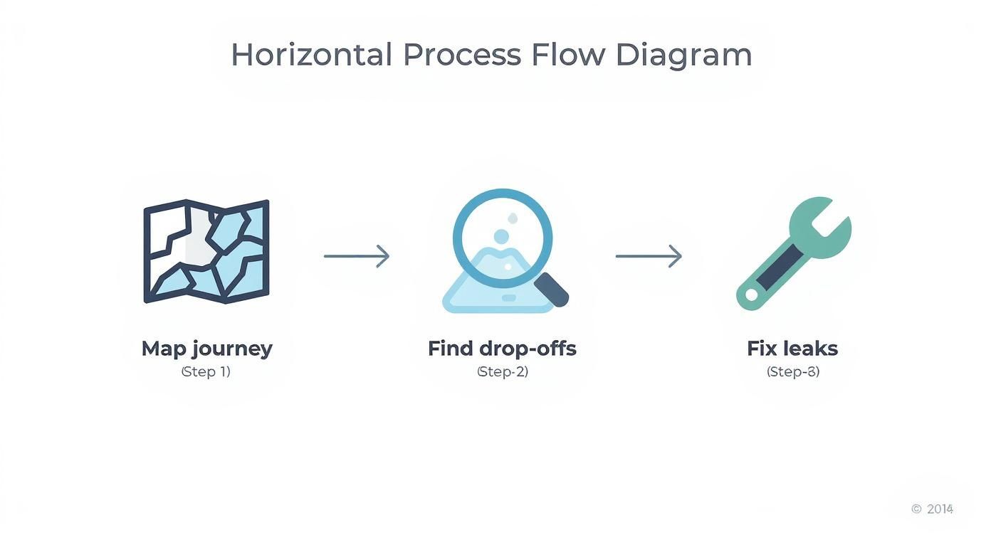
This process turns a vague goal like "increase conversions" into a concrete, actionable plan based on what your users are *actually* doing.
Pinpointing Specific Friction Points
Once your funnel is set up, you can start asking much sharper questions. Seeing a high exit rate on a specific product category page? That could signal poor product images, confusing descriptions, or pricing that just doesn't align with what people expect. For example, if your "Best Sellers" category page has a higher bounce rate than other categories, it might mean the products featured aren't actually your most appealing ones, or the layout is overwhelming.
Is there a sudden, massive drop-off the moment shipping options appear? Surprise costs are a notorious conversion killer.
To put your numbers in context, it helps to see how you stack up against industry benchmarks. While the global average ecommerce conversion rate hovers between 2% and 4%, this number swings wildly depending on the industry. Things like product type, how people shop, and price points make a huge difference.
Here’s a quick reference table to help you benchmark your store's performance.
Ecommerce Conversion Rate Benchmarks by Industry
IndustryAverage Conversion Rate (%)Personal Care6.8%Food & Beverages4.9%Fashion1.9%Home Decor1.4%
As you can see, personal care products convert at a much higher rate (6.8%) because they're often frequent, lower-cost purchases. On the flip side, industries like home decor (1.4%) and fashion (1.9%) see lower rates because shoppers take longer to decide and the price points are often higher.
Dashboards in your analytics platform provide a great high-level overview, but the real value comes from digging into specific reports like checkout behavior and shopping funnels. For more advanced strategies and tools, you can explore our guides on marketing and conversion.
This diagnostic process isn’t a one-and-done task; it’s an ongoing cycle. By regularly monitoring your funnels and investigating the drop-offs, you build a data-driven foundation for every optimization effort you make. This ensures you’re always working on the changes that will actually move the needle for your bottom line.
Optimizing Product Pages That Actually Persuade
Your product pages are your digital salespeople. Once a shopper lands here, this is where the final, critical persuasion happens. A weak product page is a dead end, but a great one makes the “Add to Cart” click feel like the natural, obvious next step. To really move the needle on your ecommerce conversion rate, you need to transform these pages from simple listings into powerful conversion engines.
This starts with getting beyond a dry list of features. While specs are important, they don't sell the product—benefits do. Frame your copy around what the customer actually gains. Instead of saying a backpack has "water-resistant nylon," say it "keeps your tech safe and dry on rainy commutes." This simple shift connects the product to your customer's real-life problems and aspirations.
Crafting Descriptions That Connect
Great product descriptions are easy to scan but still resonate emotionally. Your goal is to make the information digestible while painting a vivid picture of the product in use. When you get this right, shoppers feel much more confident in their decision.
Here’s a practical way to structure descriptions that persuade:
- Start with a Benefit-Led Summary: Kick things off with one or two sentences that immediately answer the customer's core question: "What's in it for me?" For a coffee brand, this could be "Wake up to the smoothest, richest coffee you've ever brewed at home."
- Use Scannable Bullet Points: List the top 3-5 key features, but frame them as benefits. Instead of "100% Arabica Beans," try "Rich, Never-Bitter Flavor from 100% Arabica Beans." This is for the scanners who need quick, factual info to justify their emotional decision.
- Tell a Deeper Story: Add a dropdown or a separate section for more detailed paragraphs that elaborate on the product's origin, materials, or unique use cases. Talk about the farm where the beans were grown or the specific roasting process.
This layered approach works because it caters to different types of shoppers—the quick scanner and the detailed researcher—ensuring you capture both.
The Power of High-Quality Visuals
Online, shoppers can't touch, feel, or try on your products. This sensory gap is the single biggest hurdle to conversion, and high-quality visuals are your best tool for bridging it. Photos and videos must do more than just show the product; they have to answer a customer's unasked questions.
A single, low-res photo just won't cut it anymore. To build desire and kill uncertainty, your visual strategy should include:
- Multiple Angles: Show the front, back, side, and close-ups of key details. For a handbag, this means showing the inside pockets, the zipper quality, and the texture of the material. Leave no stone unturned.
- In-Context Photos: Display the product being used. If you sell apparel, show it on a model. If you sell home decor, style it on a shelf. A photo of a tent in a sterile studio is useless; a photo of it set up on a mountain at sunrise sells an experience.
- Product Videos: A short video can demonstrate functionality, scale, and texture far better than static images ever could. A 360-degree view, for instance, lets customers digitally "handle" the item, which dramatically reduces hesitation.
- Scale and Size References: For items like furniture or clothing, show the product next to a common object or provide model dimensions (e.g., "Model is 5'9" and wearing a size Medium") to give customers a clear sense of its actual size.
> Remember, 65% of people are visual learners. Professional, well-lit visuals build immediate trust and make your brand look more credible, which is essential for convincing someone to pull out their wallet.
Building Credibility with Social Proof
No matter how persuasive your copy or stunning your photos are, shoppers will always trust other customers more than they trust you. This is the power of social proof, and it's a non-negotiable element of a high-converting product page. Seeing that others have bought and loved a product is often the final nudge a hesitant shopper needs.
The key is to display reviews, ratings, and user-generated content (UGC) strategically. Don't just bury reviews at the bottom of the page. Weave star ratings right under the product title and sprinkle testimonial pull-quotes throughout the description. A fashion brand, for example, could create a "Shop the Look" gallery featuring photos from actual customers—this not only provides powerful social proof but also helps bump up the average order value.
To gather and display this content effectively, merchants often turn to specialized tools. For Shopify store owners, exploring options for visual product reviews from Loox can be a great way to automatically collect customer photos and display them in slick galleries, turning your happy buyers into your most effective salespeople.
How to Design a Frictionless Shopping Experience
A clunky, confusing website is the fastest way to kill a sale. I’ve seen it time and time again. Every bit of friction—a page that loads too slowly, a menu you can’t make sense of, a dead link—gives a potential customer another reason to just give up and leave.
The secret to boosting your conversion rate isn't some magic trick; it's about methodically sanding down all the rough edges in your shopping experience. You want to make the journey from "Ooh, I like that" to "Add to Cart" feel so smooth and natural that your customers don't even have to think about it.
It all starts with a mobile-first mindset. This isn't just a buzzword anymore; it's a basic requirement for staying in business. Globally, mobile devices are expected to account for roughly 73% of all retail site visits. But here’s the kicker: desktop is still where most of the buying happens. Mobile conversion rates hover around 2.9%, while desktop users convert at a much healthier 4.8%.
That gap tells a story. People love browsing on their phones, but they often get frustrated and switch to a a desktop to finalize the purchase. Your job is to close that gap by making your mobile experience just as seamless. You can dig into more of these ecommerce conversion benchmarks on speedcommerce.com.
Simplify Your Site Navigation
Think of your navigation menu as the front door to your store. If it’s cluttered and confusing, people will turn right back around. The goal is to reduce cognitive load—make it ridiculously easy for shoppers to find what they’re looking for. If your main menu looks like a novel with 15 different chapters, you're causing analysis paralysis.
I once worked with a growing apparel brand whose main menu was a sprawling mess. They had over a dozen categories, including vague labels like "Collections" and "Lifestyle." We used heatmaps and watched some session recordings, and it quickly became clear that shoppers were only clicking on a handful of the core categories.
> The Insight: Complexity is the enemy of conversion. We slashed their navigation from 15 confusing options down to just 6 core categories like "Tops," "Bottoms," and "Dresses." The result? A 14% jump in category page views and a 9% lift in add-to-cart actions inside of a month.
Tools like Hotjar can give you a heatmap visualization just like this one. The red spots show you exactly where people are clicking.

The data doesn't lie. Users gravitate toward simple, direct links and tend to ignore anything that sounds overly clever or ambiguous. When it comes to navigation, clarity always beats creativity.
Implement Smart Search and Effective Filters
A lot of your best customers—the ones who know what they want—will skip your beautiful navigation entirely and head straight for the search bar. An intelligent site search isn't a nice-to-have feature; it's a critical conversion tool. When someone types in "black running shoes size 9," they expect to see exactly that, not a random page of black t-shirts.
To make your search work for you, not against you, it needs a few key things:
- Autocomplete and Suggestions: As soon as someone starts typing, your search bar should be predicting their query and suggesting popular products. It’s a small thing that makes a big difference.
- Typo Tolerance: A simple spelling mistake should never, ever lead to a "no results found" page. Your search needs to be smart enough to correct common errors like "blakc" to "black."
- Robust Filtering Options: Once they get to a results page, let them slice and dice the options. Filters for size, color, price, brand, and customer rating empower shoppers to zero in on their perfect product fast. For a clothing store, letting users filter by "Sleeve Length" or "Neckline" is far more useful than generic options.
Even with the best navigation and search, questions will pop up. A live chat tool can be a lifesaver, providing instant answers and guiding uncertain shoppers toward a purchase. We've reviewed tools like Tidio for live chat and AI chatbots that do a great job of bridging this gap.
Streamlining Your Checkout to Slash Cart Abandonment
Your checkout is the final hurdle. It’s the one-yard line. After all the hard work of getting a customer this far, this is where you absolutely have to score. But if this final step is clumsy, confusing, or full of surprises, even your most motivated shoppers will walk away.
This is also where a massive opportunity lies. Despite how common online shopping has become, the average cart abandonment rate is still a staggering 70.19%. Think about that—for every ten shoppers who add an item to their cart, seven of them leave without buying. This signals that stores are losing sales left and right due to fixable issues like a clunky checkout process, unexpected costs, or a simple lack of trust. For a closer look at the data, you can explore more ecommerce statistics from flowlu.com.
Eliminate Last-Minute Surprises and Hidden Costs
The number one conversion killer at checkout is the last-minute surprise. A shopper has already mentally committed to a price. Then, right at the end, they get hit with a shipping fee or tax that wasn't mentioned before. It feels deceptive, and it instantly shatters trust.
This psychological barrier, known as sticker shock, is entirely avoidable. Transparency is your most powerful tool here.
- Display All Costs Upfront: Add a shipping calculator right on the product page or in the cart. Let customers pop in their zip code to see the full cost *before* they even begin checking out.
- Be Honest About Taxes: If you collect sales tax, make it visible early. A simple line like "Taxes calculated at checkout" is a start, but showing an estimated amount is far better.
> A Practical Insight: I once worked with a home goods store that saw a 30% drop-off on their final payment page. We discovered their high shipping costs were only revealed at the very last step. By moving a shipping estimator to the cart page, their cart-to-purchase completion rate jumped by 18% almost overnight.
Make Checking Out Effortless
Every single field a customer has to fill out, and every click they have to make, is another chance for them to second-guess their purchase. Your mission is to remove every non-essential step from the process.
#### Offer a Guest Checkout Option
Forcing users to create an account is one of the top reasons for cart abandonment. It feels like a long-term commitment when all they want is to make a simple purchase. Always, always offer a prominent guest checkout option.
You can still prompt them to create an account *after* the purchase is complete on the thank you page. Just frame it as a benefit, like "Save your info for next time" or "Track your order easily."
Choose the Right Checkout Flow
There's a constant debate in ecommerce: one-page checkout or a multi-step flow? The truth is, neither is universally better. The right choice depends entirely on your products and your audience.
Checkout TypeProsConsBest ForOne-Page CheckoutFaster, less intimidating, all fields are visible at once.Can feel cluttered or overwhelming if there are too many fields.Stores with simple products and fewer required shipping details.Multi-Step CheckoutCleaner, more organized, less cognitive load per step.Can feel longer, risk of drop-off between steps.Stores with complex orders, custom products, or international shipping.
If you do go with a multi-step checkout, a progress bar is non-negotiable. It shows the customer exactly where they are in the process and how much is left. This one small addition manages their expectations and reduces the anxiety of a seemingly endless checkout.
Finally, give your customers the easiest path to payment. Integrating popular methods like Apple Pay, Google Pay, and PayPal enables one-click payments, which is the gold standard for a frictionless experience. These express options let shoppers bypass manual entry of their shipping and billing info, turning a multi-minute process into a matter of seconds.
Using Trust and Urgency to Drive Action
At the end of the day, a customer's decision to buy boils down to psychology. Once you’ve dialed in your pages and streamlined the checkout, the final push often comes down to two powerful emotional levers: trust and urgency. Learning how to use them ethically is a huge step in turning hesitant shoppers into confident buyers.
Trust is the bedrock of any online sale. Shoppers are about to hand over sensitive financial details, and they need to feel completely safe doing so. If your site looks even the slightest bit sketchy, they’re gone. Building that instant credibility isn't just a nice-to-have; it's a matter of survival.
Building Instant Credibility and Trust
The best trust signals are visual and instantly recognizable. They work on a subconscious level to reassure customers that your store is legit and their data is secure. You don’t need to reinvent the wheel here—just show them the symbols they already know and trust.
A few must-haves for building this credibility include:
- Security Badges: Displaying an SSL certificate badge (like Norton or McAfee) in your site’s footer or on the checkout page is non-negotiable. It’s a universal sign that the connection is encrypted and safe.
- Payment Logos: Showing logos for major credit cards (Visa, Mastercard) and trusted gateways like PayPal, Apple Pay, and Google Pay provides immediate familiarity and comfort.
- A Clear Return Policy: A friendly return policy is one of the most powerful trust signals you have. Highlighting something like "30-Day Hassle-Free Returns" right on the product page can slash purchase anxiety.
> I see so many stores bury their return policy on some hard-to-find page. Don't make that mistake. Feature a one-sentence summary of your policy directly below the "Add to Cart" button. This simple move addresses a huge point of hesitation at the most critical moment.
By proactively answering a customer's security and policy questions before they even have to ask, you're removing major roadblocks to conversion and creating a much smoother path to purchase.
Creating Ethical Urgency to Prompt Action
While trust makes someone feel *safe* enough to buy, urgency gives them a reason to buy *now*. The fear of missing out (FOMO) is a powerful motivator, but you have to use it ethically. The goal is to create genuine scarcity or time-sensitivity, not to trick shoppers with fake pressure.
Done right, urgency nudges indecisive shoppers over the finish line, stopping them from putting off their purchase and potentially forgetting about it completely.
Here are a few proven ways to create authentic urgency:
- Low Stock Alerts: A simple message like "Only 3 left in stock!" creates real scarcity. This works best when it’s tied to your actual inventory system so the information is always accurate.
- Countdown Timers for Sales: A visible timer counting down the hours and minutes until a sale ends is incredibly effective. Just make sure you use it for genuine promotions, like a flash sale or holiday discount, to maintain credibility.
- Limited-Time Offers: Highlighting deals like "Free shipping on all orders this weekend only" gives people a clear deadline. It encourages immediate action without making you look like you're constantly discounting your products.
Think about a fashion retailer running a 24-hour flash sale. They might place a countdown timer in a banner at the top of every page. Then, on the product pages for popular items, they add a "Selling fast!" tag. This mix of time-based urgency and social proof encourages shoppers to act quickly before the deal—or the product—is gone. The key is that the urgency is real; the sale actually ends when the timer hits zero, preserving customer trust for the next promotion.
Frequently Asked Questions
Navigating the world of conversion optimization always brings up a lot of questions. Here are some clear, practical answers to the most common ones we hear from merchants in the trenches.
What Is a Good Ecommerce Conversion Rate?
Globally, a "good" ecommerce conversion rate hovers between 2% and 4%. But honestly, fixating on a single number is a mistake. That figure swings wildly depending on your industry, product price, and where your traffic is coming from.
For instance, a low-cost industry like personal care might see rates north of 6%, while stores selling high-ticket home decor could average closer to 1.4%.
The best approach? Benchmark against your *specific* industry, and more importantly, focus on consistently improving your *own* rate over time. Your real goal should be steady month-over-month and year-over-year growth. That's the true sign your optimization efforts are paying off.
How Long Does It Take to See an Improvement in Conversion Rate?
The timeline for seeing real improvements can vary a lot. Small, targeted changes from an A/B test—like tweaking a call-to-action button or rewriting a headline—can produce statistically significant results in just a few weeks, assuming you have enough traffic.
> On the other hand, bigger strategic shifts, like a full website redesign or overhauling your entire checkout process, might take a few months to implement and measure accurately. Sustainable growth in your ecommerce conversion rate is the result of continuous, iterative testing and optimization over the long haul.
Which Single Change Has the Biggest Impact on Conversion Rates?
While there’s no magic bullet that works for every single store, optimizing the checkout process almost always delivers the biggest and most immediate impact. The average cart abandonment rate is a staggering 70%, meaning a huge number of high-intent shoppers are dropping off at the very last step.
Changes in this area directly tackle the biggest points of friction. These include:
- Offering a guest checkout option: This removes the barrier of forcing someone to create an account.
- Being transparent about all costs upfront: Nobody likes the sticker shock of surprise shipping fees.
- Providing multiple payment methods: Integrating options like PayPal, Apple Pay, and Google Pay makes payment effortless.
Think about it: simplifying a checkout from five steps down to three is going to have a much larger impact than changing a button color on the homepage.
Should I Focus on Optimizing for Mobile or Desktop First?
You absolutely need a "mobile-first" design, but never at the expense of an excellent desktop experience. Here's why: while desktop users still convert at a higher rate (around 4.8% vs. 2.9% for mobile), the vast majority of traffic—about 73% of it—now comes from mobile devices.
If your mobile experience is clunky or frustrating, you're alienating the largest segment of your audience before they even get a chance to consider buying. A smooth, intuitive mobile experience ensures you capture and engage this massive audience. A well-designed responsive site will then automatically adapt that positive experience for desktop users, who are often ready to complete their purchase with a bit more focus.
--- Finding the right Shopify apps to implement these strategies can feel overwhelming. At TheSaasHub, we cut through the noise by curating only the most effective, expert-vetted tools to help you boost your conversion rate. Explore our hand-picked app collections and build a toolkit that drives real results for your store.
how to increase ecommerce conversion rate: A Practical Guide